What’s on my iPhone, and how I wish I could lay it out
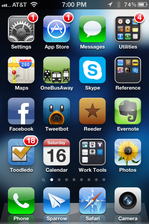
I love seeing what’s on other people’s iPhones — i.e. what apps do they swear by, what’s important enough to go on their Home screen, how they arrange things. Here’s mine:

Note that I’m using Sparrow for email. Those guys took on a big challenge trying to improve on one of Apple’s built-in apps, but they’ve done it! Lots of subtle but compelling advantages over the standard mail client. The key feature for me is that is lets me use alias domains when sending from my Google Apps account.
My “Work Tools” folder has a few great apps for my job, like Nezumi for administering Heroku servers, and TestFlight for distributing iOS apps for testing.
I actually make only sparing use of folders. Sure, they help you pack way more apps on one screen. But for me, a whole screen full of those things is so visually boring that it really bums me out. Seriously. I’m a lot happier when I can look at a screen of big beautiful icons.
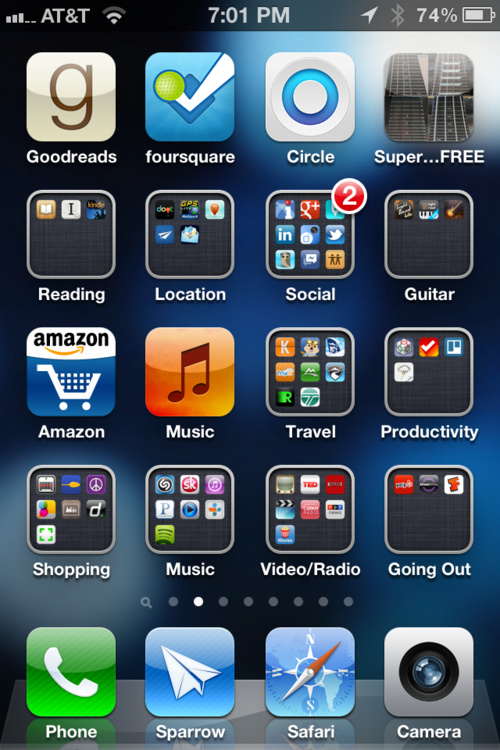
I use folders in a special way on my second screen. I have a bunch of “second tier” apps, many in related categories, but usually with one that I use most often. So I decided to arrange them in pairs, with one “lead” app sitting on its own, and a folder of related apps below it. For example, for shopping, I mostly use the Amazon, but sometimes the REI or Craigslist apps. So Amazon gets its own icon, but the secondary apps are always close by:

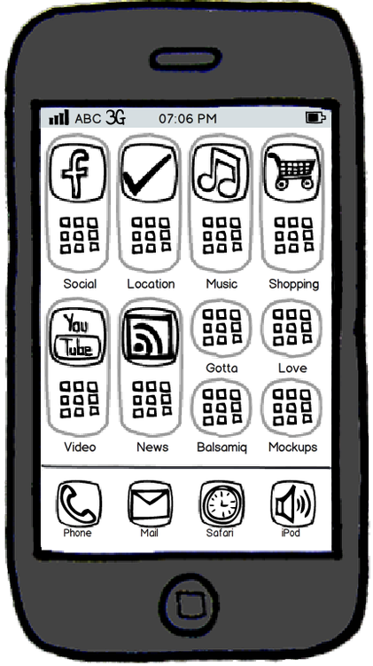
I really wish there was some built-in way to group apps like this — i.e. a group of apps with one “lead” app displayed more prominently, like this:

Don’t know if Apple will ever implement something like this, but this is what I picture in my head when I look at my second screen.
Oh yeah, and the rest of my screens are all games!
.jpeg)